
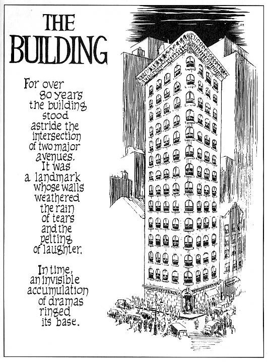
Will Eisner is an artist who is sometimes called the 'Father of the Graphic Novel'. This is from his the venture into short stories in the form of 'Sequential Art' whilst searching for a more mature approach to produce comic book art. Works such as, 'A contract with God' and 'The Building' helped sequential art move into a more thought provoking and sophisticated story telling tool, as opposed to the comical ''funny books'' of tradition.

Eisner's early work uses all the best known sequential image making techniques to convey narratives and adopts a classical comic book style in its visual state, semi-realistic linework, detail and colour schemes. His most standout work for me is the spirit, which recieved critical acclaim and is a widely revered series of comic stories. The spirit has been re-created and republished well into the last decade and was adapted into a feature film by the Artist, Writer and director, Frank Miller, who used his dark film noir style to give the film a dramatic, punchy and artistic style similar to his other works of 'Sin City' and '300'.

Frank Miller
Frank miller is arguably one of the most well known graphic novel artists and his recongnisable style of dark sillhouettes, purposfully limited colour choice and cinematic pacing is inspiring and is something that has been in the back of my mind whilst experimenting in the initial stages of my 'Jump!' Strip, where i have currently been experimenting with black and white photocopying and deep contrast to create a dramatic mood.
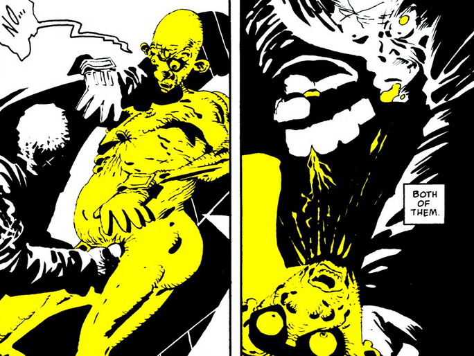
Miller purposefully limits his use of colour to control and invoke emotional responses in the audience, create and exaggerate identity in characters and intensify the dramatic visual style of his work. This is a powerful technique that works at drawing attention to certain features and clarify the intended emotional response, for example, the yellow villain invokes feelings of disgust, repulsion and his inhumanity, Red for passion or gore. I will consider using techniques such as this in my own work, being careful to consider how i want my audience to react to the work emotionally and not distract from the narrative.
Frank Millers '300' is one of my favourite pieces of artwork. Its high contrast, dramatic linework and tone, coupled with a beautiful handpainted colour pallete create a graphic novel that not only tells a truly epic story but, despite the violence, invokes deep and subtle emotion and is brilliantly paced.

The epic scale of the narrative is not only told through words but also in its visual style, where full page spreads of a single illustration are frequent and constantly remind the audience of the huge task of the spartans, punctuating the frantaction action-to-action pace of the combat. These subtle pacing changes really create something that flows up and down keep the audience involved and interesed in the narrative, which is something that i should consider when creating my own sequential illustrations.

No comments:
Post a Comment