This is the final render of my zoetrope animation that i have made into a Gif. Adding the grey background has really helped to make the main features of the animation to stand out. This is the first gif i have ever made and it was a fun process and surprisingly simple.
Calvin and Hobbes is an online comic strip by Bill Watterson that features a kid going on imaginary adventures with his stuffed tiger. The light hearted narratives work as standalone with each strip having its own little joke to make you smile, but also work as a larger continuous narrarive.
Watterson uses simple black and white linework and fills to define his shapes which keeps the work simple and focused on the story. These comics are a good source of inspiration for the current direction I am taking in my stage 2 project, the imagination of children and escapism of the real world, toys with persona etc.
Watterson relies quite heavily on text to direct the narrative in his strips but i plan to use limited text as i feel this can add a more mature feeling to the work.
TOY STORY
My current direction has also got me thinking about toy story and how they put these small characters in a larger world. This particular scene illustrates the possible actions, problems and scenarios that can make the characters feel helpless and reliant on the luck and chance of the larger world they have no control over. I particularly like how the characters become lifeless when a human interacts with them and no matter what their fate might be they just remain lifeless to not blow their own cover. Magic.
Jason Deamer
Jason Deamer is one of the character artists behind some of the awesome pixar films, most notably ratatouille. This realism mixed with a slight sense of characterisation and characatuer style is something that im hoping to create in my nobrow sequence. When drawing up the sketches from my intitial ideas i immediately started to feel the feelings that often come with the narratives of pixar films, Slight realism mixed with cartoony 'larger than life' portrayals that really give a greater sense of character to the individuals in a story. I think that this blend of styles and narratives is what makes Pixar's work so appealing to such a vast audience.
The incredibles
Above is a storyboard of the entire film, 'The Incredibles', which explores the Emotion portrayed in each key scene through the use of colour. This is an important part of the design and storyboarding process that, even when the details within the characters/objects/enviornments change, is unaffected, as the broad sense of emotion and how that changes over teh course of the film is something that is almost set in stone from the beggining of a project.
The Incredibles continues the Pixar style of realism in setting with highly stylised characters that boost the storytelling of an individuals personal traits and behaviour.
Patrick Brown
Patrick Brown is a big inspiration for me when looking for comic book style artwork. The classical comic book style permeates his work and his well controlled linework with a tablet is something that is hard to recreate. Browns work use the similar exaggerated character styles in realistic settings that is a theme in my research and seeing the subtle and extreme ways people take it is a big help at decidign how far i want to go with my work. Patrick browns technique is one that i have been practicing from video tutorials he has uploaded onto youtube.
'Closet Monster' - Rafael Nascimento
Rafael Nascimento's Clsoet Monster illustration shows how rendering can be taken very far to create something that resembles an animated film with its form and realism mixed with heavy characterisation. If i was to take my illustrations in my narrative this far, i would have to bear in mind the timeframe as, while capable of producing work as rendered as this is in my skill set, it takes me a very long time to achieve these kind of results.
As I had chosen 'Rocket Ship' as the starting point for my narrative I began looking at sequences related to the themes of space. I specifically started looking in Nobrow 7 'Brave new World' as the brief was to create a sequence as if it were for Nobrow. The first i found was this story written by Alex Spiro and Illustrated by Mikkel Sommers. The story uses a factual basis to make set the scene and ends on an ironic note that whilst amusing is pretty morbid. I really like the use of recurring colours throughout the story which helps to add a subtle visual dynamic to the overall story.
Tom Gauld - Alphabetical Guide to our Dreadful/Wonderful Future
Tom Gaulds simple designs and colour palletes are simply satisfying to look at and this comic is no exception. The juxtaposing looks at two possible futures is an interesting and thought provoking experience but its style is light hearted and isn't too much to make the viewer feel down emotionally. This is another example of how something simplistic visually can still be interestign due to subject matter. The slightly more illustrative style that divides the panels helps to make the work more interesting and less serious as could be thought from the title of the narratives.
Leather Spaceman - Michael Deforge
This piece by Michael Deforge shows how something such as a 'Spaceman' can be completely different from what the reader expects which is somethingi could consider in my own work. How can my starting point be simply a point in which something completely abstract and unexpected grows? I explored this way of working in the 'Jump' Workshop and produced completely organic results that i feel stood out from the crowd.
Back to Earth - Andrew Rae
Andrew Rae's Back to earth is a short and simple, yet heart warming silent narrative that explores the themes of lonliness and the purpose of life. The zine uses simple black and white lineart and filled black to simply convey the story. Im not sure if i would choose to work in this way as it takes alot of confidence to say that lineart is a finished piece but it think the zine format with a full colour cover and rear cover help to show this is purposful and adds the finished touch.
Zoetropes are an old fashioned animation device that works to create the illusion that something is moving due to the strobing effect of the slots in the side as it spins.
PIXAR ZOETROPE
This video demonstrates the amazing complexity that zoetrope animations can become but also how simple they can be. As mine will be 2D and my first attempt, it will be best to keep things simple to first understand how the process works. The 3D zoetropes that have been made such as these pixar and studio ghibli ones are beautiful representations of how a simple device can create a magical feeling life into a drawing or sculpture.
Flickbook Animation
Flickbook animation works in the same way as zoetrope animation, where frame speed is created by the image quickly changing. However with flickbooks the animation can have an end and go on for as long as the book you make it in, where zoetropes are most effective on a continuous loop. Here is an example of how awesome flickbook animations can be that i found on youtube:
Vintage Mickey Mouse - Walt Disney
Vintage Mickey mouse cartoons such as this show how the concept of flickbook/zoetrope animation was adapted for television, the same concepts are used to create the imagery. Note the simple, repetitive animations such as the steamboats steam vents and backdrop. Traditional animation is a very time consuming process without digital software, so being simple and efficient was the best way to add length and substance without slaving too much. An interesting feature is how mickeys ears always retain their 2d form, even when his head turns.
Old Videogames
Old videogames such as Sonic the Hedgehog on SEGA used the same forms of animation, using sequential images, to make their characters move and animate on the screen at the hands of the player. A sheet of 'Sprites' is created with each stage of a characters movement laid out in a zoetrope like manner. The brightly coloured background works like green-screen and becomes invisible.
Here is an example of the animation frames in motion:
All these examples show how the concept of the long standing zoetrope was the starting point for a beautiful array of animated artwork and characters across an array of media for the last century. Modern 3d animation is slowly taking over and 2d animation tools are leading to a world with less of the traditional animation styles, but can never take away the magic that is created from something as simple as a zoetrope.
COMIX ZONE
Comix zone was an old SEGA game that had an interesting medley of sequential art and comic book stuff. The game uses the same sprite based animation that sonic used but what i find particularly compelling is that the game is an adventure through a comic book that has trapped its creator inside. This means that not only are the games characters animated in traditional way, but the backdrop is a secondary form of sequential story telling that uses traditional graphic novel/ comic book methodology to tell its stories.
Here is a video of the game in action found on youtube:
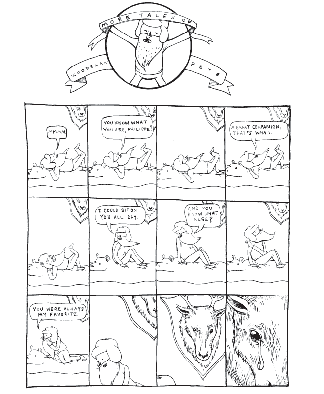
This is an example of one of Lilli Carre's tales of woodsman pete comics. I chose this particular strip to comment on the pacing of the narrative. The enviornment and image itself barely changes at all during the whole narrative and this is effective at giving the slow paced, relaxed feel that is in the narrative being told. The third panel in particular is so strong at creating a pause, and adding length to a simple story and conveying a sense of non-urgency.
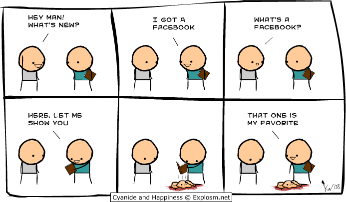
Kris Wilson - Cyanide and Happiness
Kris Wilson's cyanide and happiness is a hugely successful series of webcomics that are popular for it's various puns and humorous takes on social and pop culture. The stylised characters and low-res aesthetic prove that strong subject matter can be what makes or breaks sequential art, not just the art itself. Of course Cyanide and Happiness' visual style has been replicated and ripped of with resulting in legal struggles in the past.
Below is a Romantically Apocalyptic collaboration work that Kris Wilson produced with Vitaly Alexius and Shawn Cross, and shows how visual style is an important factor in communicating the narrative. As the character 'Pilots' mind turns to mush, the visuals of the narrative change and slowly become akwardly simplistic and the pace is changed by subtle transitions and small amounts of dialogue just increase the weirdness of the situation. Beautiful.
Motion Comics
Motion comics are an interesting hybrid of comic book style artwork that is played in sequence sometimes using various visual after effects, sounds, dialogue or music to bring them to life.
Here is an example of a Motion comic found on youtube.
Pacing is created by camera movement and cuts, just like information in a traditional comic is arranged in specific panel transitions to slow or speed things up. the viewers imagination has to fill in the gaps but the mood and action to action scenes can be heightened using small true animations and atmosphere changes. This is a very interesting form of sequential image making that would be fun to explore when the brief accommodates.
Lord of the Rings Storyboarding process
This video from the making of the lord of the rings shows the pivotal improtance of storyboarding in a project, to ensure that the full possibilities and most imaginative of ideas are explored. It also highlights how sequential imagery is one of the cheapest and most basic ways to tell a story, yet is still one of the most effective ways of doing in and is relied on in even the most ambitious projects such as these huge award winning films.
Romantically apocalyptic is a webcomic set in a post apocalyptic future and follows the lives of Zee Captain and his freinds as they adventure throughout the wasteland.
The creator, Vitaly Alexius, creates powerful distopian imagery through a blend of studio/greenscreen photograhy and digital matte painting. Humourous juxtaposition is created through the amusing monty python-esque dialog and characterisation whilst being presented on a backdrop of a devastated world filled with depressing hues and distopian texture.
Incredible beauty and atmosphere has been created by alexius out of subject matter that could easily depress and bring down the viewer but does exactly the opposite. The visual style of his work is something that i find personally satisfying, and is so self explanitory that it is hard to describe its incredible qualities.
Above is an example of a strip from the actual comic. Using photography as his medium for creating his characters, it is easy to see how important capturing the perfect pose is at conveying the qualities and narrative of the strip, especially when the characters have no faces to express emotions upon. Alot is left to the readers imagination in this area, assisted by colours, dialog (or lack of) and pose. The humour is created brilliantly through strong use of juxtapositions between narrative, character and setting. Another device to make note of is how the speech is connected to speaker by colour coordination, Engie has orange goggles so his speech is orange, snippy's goggles are blue so his speech is blue.
The visual style of this work is something that has really inspired me in producing my Jump piece, which also has post apocalyptic themes.
Oh and another thing...
Whilst browsing through the romantically apocalyptic archives i found this piece of guest artwork which has a good example of an untypical action-to-action scene. The second,third and fourth panels or actions are not seperated by individual frames but the action is still clear, flowing through a single piece of enviornment. The despite the lack of seperation it is still clear to the viewer that it is not 3, but one character moving through the scene by use of motion lines that lead the eye through the characters fall with the imagination filling the gaps. This is a good example of the visual language of sequential image making and how using visual prompts such as pose and motion lines creates clarity.
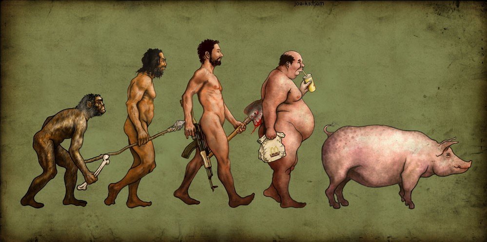
Evolution Sequences
This is a piece of artwork by an artist i found on Deviantart under the alias 'Brabuss'. This style of work shows another form of sequential illustration, where the passing of time is illustrated through changes in physiology, technology and social evolution. This is an interesting take on the traditional darwin model, and is a good example of how some narratives require some educated knowledge of another topic to make sense. As a standalone this image would have to rely on the themes within the image itself to show the passing of time, which it does to a degree, but the fact the viewer already recognises the subject matter as an interperetation of Darwins evolution model means that most of the narrative work has already been done by the viewers own knowledge.
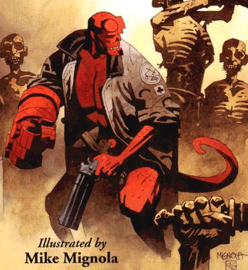
Mike Mignola's Hellboy illustrations are a very unique entry in the world of graphic novels and comic book art. Not quite as hardcore black and white as frank miller, yet not as traditionally comic book as DC's Rob Leifields work. Mignolas work uses a handsome and well considered colour pallet in his illustration that underlays emotion and realistic grit to fairytale characters and villains.
Hellboys character and adventures are compelling through use of humour, and action. The fact that the story of Hellboy is embedded in the roots of real history with Mignolas cunning use of Satanic Nazi's and villains from the biblical representation of hell only helps to expand understanding and story telling for the audience, who can relate to the evil that has been embedded in the culture of out modern lives. These devices are strong ways to get the ball rolling for an audience who are looking for alternate realities to escape to in their free time and with its popularity as a comic, shows the strength of using historical and cultural references as a starting point for visual styles and narratives.
In my experiments with 'Jump!' today, i have been considering how to use subtle imagery that people recognise to invoke a feeling and understanding in the narrative that i am trying to create, i have done this through using propaganda type imagery, dark brooding colour schemes and an apocalyptic visual style.
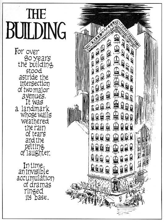
Will Eisner is an artist who is sometimes called the 'Father of the Graphic Novel'. This is from his the venture into short stories in the form of 'Sequential Art' whilst searching for a more mature approach to produce comic book art. Works such as, 'A contract with God' and 'The Building' helped sequential art move into a more thought provoking and sophisticated story telling tool, as opposed to the comical ''funny books'' of tradition.
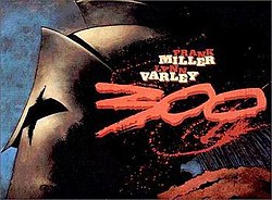
Eisner's early work uses all the best known sequential image making techniques to convey narratives and adopts a classical comic book style in its visual state, semi-realistic linework, detail and colour schemes. His most standout work for me is the spirit, which recieved critical acclaim and is a widely revered series of comic stories. The spirit has been re-created and republished well into the last decade and was adapted into a feature film by the Artist, Writer and director, Frank Miller, who used his dark film noir style to give the film a dramatic, punchy and artistic style similar to his other works of 'Sin City' and '300'.
Frank Miller
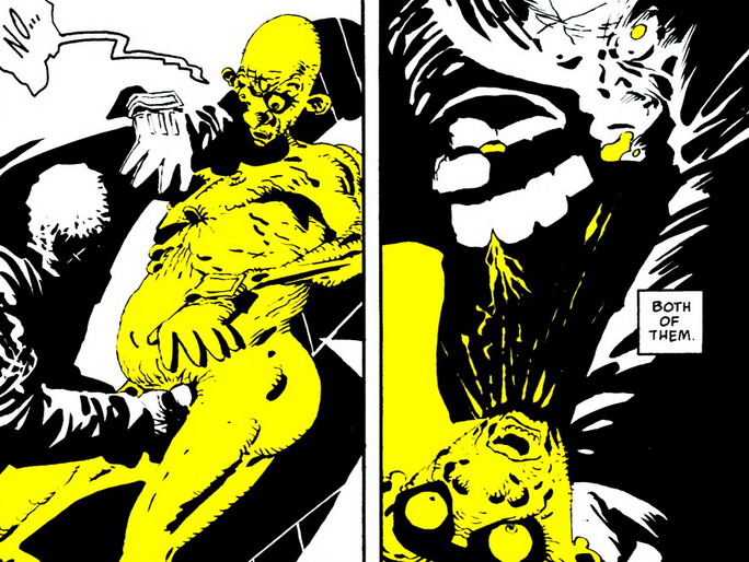
Frank miller is arguably one of the most well known graphic novel artists and his recongnisable style of dark sillhouettes, purposfully limited colour choice and cinematic pacing is inspiring and is something that has been in the back of my mind whilst experimenting in the initial stages of my 'Jump!' Strip, where i have currently been experimenting with black and white photocopying and deep contrast to create a dramatic mood.
Miller purposefully limits his use of colour to control and invoke emotional responses in the audience, create and exaggerate identity in characters and intensify the dramatic visual style of his work. This is a powerful technique that works at drawing attention to certain features and clarify the intended emotional response, for example, the yellow villain invokes feelings of disgust, repulsion and his inhumanity, Red for passion or gore. I will consider using techniques such as this in my own work, being careful to consider how i want my audience to react to the work emotionally and not distract from the narrative.
Frank Millers '300' is one of my favourite pieces of artwork. Its high contrast, dramatic linework and tone, coupled with a beautiful handpainted colour pallete create a graphic novel that not only tells a truly epic story but, despite the violence, invokes deep and subtle emotion and is brilliantly paced.
The epic scale of the narrative is not only told through words but also in its visual style, where full page spreads of a single illustration are frequent and constantly remind the audience of the huge task of the spartans, punctuating the frantaction action-to-action pace of the combat. These subtle pacing changes really create something that flows up and down keep the audience involved and interesed in the narrative, which is something that i should consider when creating my own sequential illustrations.