Thursday 27 September 2012

Romantically Apocalyptic


Romantically apocalyptic is a webcomic set in a post apocalyptic future and follows the lives of Zee Captain and his freinds as they adventure throughout the wasteland.

The creator, Vitaly Alexius, creates powerful distopian imagery through a blend of studio/greenscreen photograhy and digital matte painting. Humourous juxtaposition is created through the amusing monty python-esque dialog and characterisation whilst being presented on a backdrop of a devastated world filled with depressing hues and distopian texture.


Incredible beauty and atmosphere has been created by alexius out of subject matter that could easily depress and bring down the viewer but does exactly the opposite. The visual style of his work is something that i find personally satisfying, and is so self explanitory that it is hard to describe its incredible qualities.


Above is an example of a strip from the actual comic. Using photography as his medium for creating his characters, it is easy to see how important capturing the perfect pose is at conveying the qualities and narrative of the strip, especially when the characters have no faces to express emotions upon. Alot is left to the readers imagination in this area, assisted by colours, dialog (or lack of) and pose. The humour is created brilliantly through strong use of juxtapositions between narrative, character and setting. Another device to make note of is how the speech is connected to speaker by colour coordination, Engie has orange goggles so his speech is orange, snippy's goggles are blue so his speech is blue.

The visual style of this work is something that has really inspired me in producing my Jump piece, which also has post apocalyptic themes.

Oh and another thing...


Whilst browsing through the romantically apocalyptic archives i found this piece of guest artwork which has a good example of an untypical action-to-action scene. The second,third and fourth panels or actions are not seperated by individual frames but the action is still clear, flowing through a single piece of enviornment. The despite the lack of seperation it is still clear to the viewer that it is not 3, but one character moving through the scene by use of motion lines that lead the eye through the characters fall with the imagination filling the gaps. This is a good example of the visual language of sequential image making and how using visual prompts such as pose and motion lines creates clarity.

Evolution Sequences


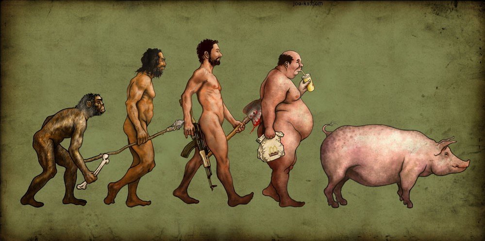
This is a piece of artwork by an artist i found on Deviantart under the alias 'Brabuss'. This style of work shows another form of sequential illustration, where the passing of time is illustrated through changes in physiology, technology and social evolution. This is an interesting take on the traditional darwin model, and is a good example of how some narratives require some educated knowledge of another topic to make sense. As a standalone this image would have to rely on the themes within the image itself to show the passing of time, which it does to a degree, but the fact the viewer already recognises the subject matter as an interperetation of Darwins evolution model means that most of the narrative work has already been done by the viewers own knowledge.

Tuesday 25 September 2012

Mike Mignola

Hellboy


Mike Mignola's Hellboy illustrations are a very unique entry in the world of graphic novels and comic book art. Not quite as hardcore black and white as frank miller, yet not as traditionally comic book as DC's Rob Leifields work. Mignolas work uses a handsome and well considered colour pallet in his illustration that underlays emotion and realistic grit to fairytale characters and villains.


Hellboys character and adventures are compelling through use of humour, and action. The fact that the story of Hellboy is embedded in the roots of real history with Mignolas cunning use of Satanic Nazi's and villains from the biblical representation of hell only helps to expand understanding and story telling for the audience, who can relate to the evil that has been embedded in the culture of out modern lives. These devices are strong ways to get the ball rolling for an audience who are looking for alternate realities to escape to in their free time and with its popularity as a comic, shows the strength of using historical and cultural references as a starting point for visual styles and narratives.

In my experiments with 'Jump!' today, i have been considering how to use subtle imagery that people recognise to invoke a feeling and understanding in the narrative that i am trying to create, i have done this through using propaganda type imagery, dark brooding colour schemes and an apocalyptic visual style.

Monday 24 September 2012

Will Eisner and Frank Miller


Will Eisner is an artist who is sometimes called the 'Father of the Graphic Novel'. This is from his the venture into short stories in the form of 'Sequential Art' whilst searching for a more mature approach to produce comic book art. Works such as, 'A contract with God' and 'The Building' helped sequential art move into a more thought provoking and sophisticated story telling tool, as opposed to the comical ''funny books'' of tradition.


Eisner's early work uses all the best known sequential image making techniques to convey narratives and adopts a classical comic book style in its visual state, semi-realistic linework, detail and colour schemes. His most standout work for me is the spirit, which recieved critical acclaim and is a widely revered series of comic stories. The spirit has been re-created and republished well into the last decade and was adapted into a feature film by the Artist, Writer and director, Frank Miller, who used his dark film noir style to give the film a dramatic, punchy and artistic style similar to his other works of 'Sin City' and '300'.

Frank Miller

Frank miller is arguably one of the most well known graphic novel artists and his recongnisable style of dark sillhouettes, purposfully limited colour choice and cinematic pacing is inspiring and is something that has been in the back of my mind whilst experimenting in the initial stages of my 'Jump!' Strip, where i have currently been experimenting with black and white photocopying and deep contrast to create a dramatic mood. 


Miller purposefully limits his use of colour to control and invoke emotional responses in the audience, create and exaggerate identity in characters and intensify the dramatic visual style of his work. This is a powerful technique that works at drawing attention to certain features and clarify the intended emotional response, for example, the yellow villain invokes feelings of disgust, repulsion and his inhumanity, Red for passion or gore. I will consider using techniques such as this in my own work, being careful to consider how i want my audience to react to the work emotionally and not distract from the narrative.


 Frank Millers '300' is one of my favourite pieces of artwork. Its high contrast, dramatic linework and tone, coupled with a beautiful handpainted colour pallete create a graphic novel that not only tells a truly epic story but, despite the violence, invokes deep and subtle emotion and is brilliantly paced. 


The epic scale of the narrative is not only told through words but also in its visual style, where full page spreads of a single illustration are frequent and constantly remind the audience of the huge task of the spartans, punctuating the frantaction action-to-action pace of the combat. These subtle pacing changes really create something that flows up and down keep the audience involved and interesed in the narrative, which is something that i should consider when creating my own sequential illustrations.